A Step-by-Step Guide to Creating Professional Posters Online in Minutes
Contrary to what most people assume, you do not need a degree in graphic design to create professional posters online. With the right tools, even complete beginners can build stunning posters within minutes.
The secret is not just talent, but a repeatable process involving proven steps that can be applied for all types of online posters.
In this guide, I will walk you through the steps you need to know to create professional posters online. You will know exactly what size to pick and understand how to place text and images without second-guessing yourself.
How to Create Professional Posters Online
You can create professional posters online using the following guidelines.
1. Pick Your Online Design Tool First
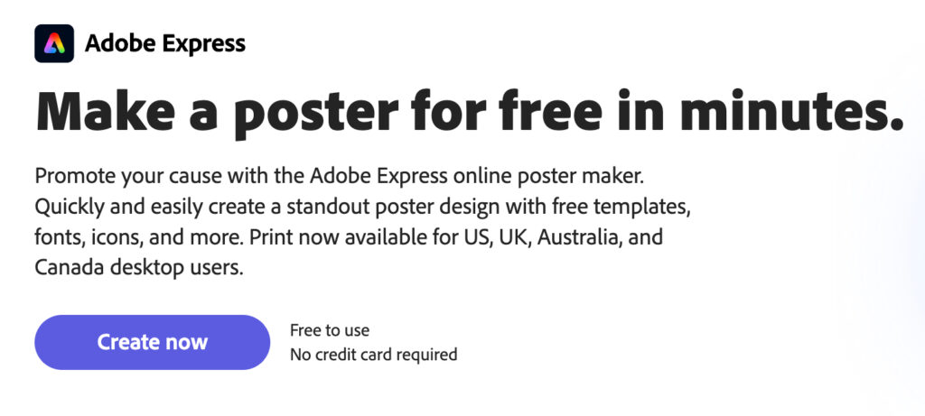
You need a tool that works in your browser, so you don’t have to download heavy software. Adobe Express is a good example of a free poster maker that’s easy to use, doesn’t require installation, and saves your work online.
You simply open the site, sign up with an email address, and start designing your posters. Most tools are premium, but they come with free versions you can use to create professional posters online.
2. Start With a Template, Not a Blank Canvas
A blank screen can be intimidating if you’re designing an online poster for the first time, so do not start there. Instead, search for a template that matches your poster type as shown below.
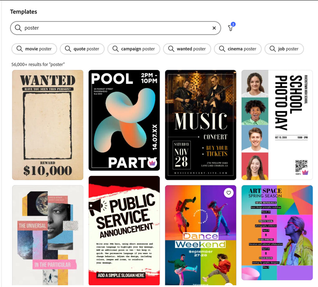
Most of the online tools provide a wide range of template options. It could be an event poster, sale announcement, quote graphic, product launch. Just choose the one matching what you want to create.
3. Set Your Canvas Size
Every platform asks for dimensions when you open a new project, and you shouldn’t skip this step. Do not use the random default size because changing it later on may throw all your poster elements out of position.
To get this right, first consider the destination platform for your online posters. For example, Instagram posts need 1080 by 1080 pixels, Facebook (1200 by 628 pixels), and YouTube thumbnails (1280 by 720 pixels).
4. Replace the Template Photos With Your Own Images
Template photos look generic because thousands of people use them. They are there as placeholders to guide you with placement. Swap them out by uploading your own product photos, team pictures, or custom graphics.
For the best results, use high-resolution images only because blurry photos ruin the professional look. If your photo looks pixelated at full zoom, find a better one. Additionally, do not stretch small photos to fit.
5. Edit the Text to Match Your Message
Besides photos, templates come with placeholder texts that don’t match the exact message you want to display. Delete all the placeholder text, then write your message from scratch.
Keep your headline under 10 words and your subheadline under 20 words. Anything longer will cause people to skip reading. Consider using active verbs like “Register Now” instead of “Registration Ongoing” to save space and reduce clutter.
6. Pick Two Fonts Maximum
Combining multiple fonts may be aesthetically pleasing, but it only creates confusion by limiting focus. You need one font for the headlines and another for the body text to avoid creating a chaotic poster.
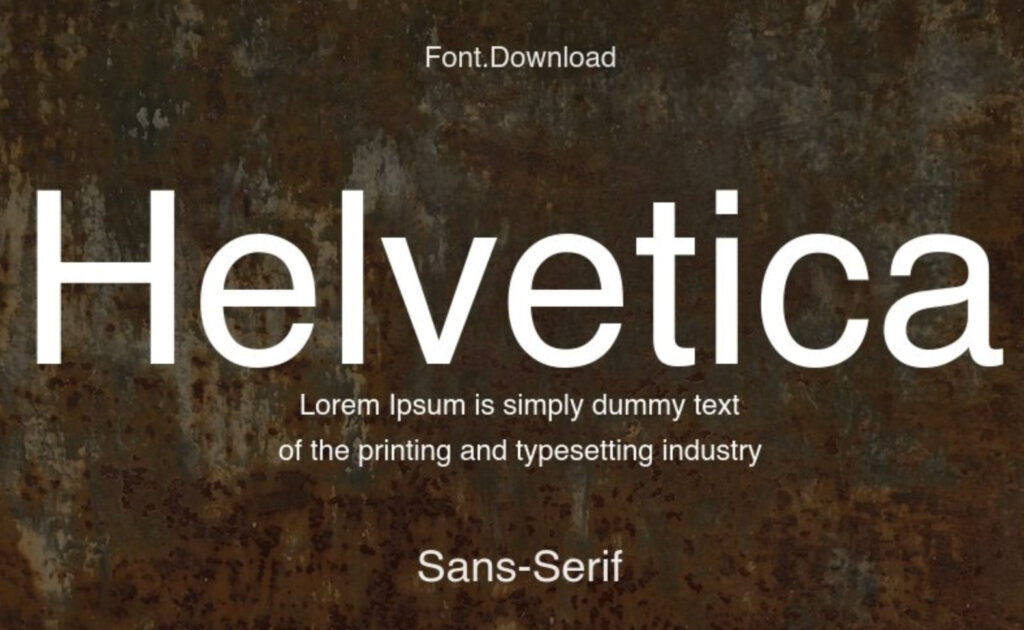
Choose sans serif fonts like Arial, Helvetica, Montserrat, or Open Sans. These fonts read clearly on screens and come with bold versions you can use to break the monotony
7. Add White Space Around Your Main Message
White space means an empty background with no text or images, and you need plenty of it. The most common beginner mistake is cramming too much stuff onto the poster.
Look at your text: is it touching the edges? Move it inward. What about your images: do they overlap your headline? Scale them down. You need to give every element the room to breathe to improve readability.
8. Check Contrast Between Text and Background
Low contrast text forces people to squint, while high contrast text jumps off the screen. This can work against you in the long run, so you need to test your contrast before you export anything.
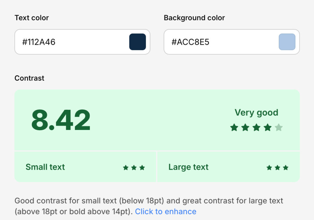
You can use a free online contrast checker by pasting your background color and your text color as shown above. Aim for a ratio above 4.5 to 1. If the ratio fails, change your text color or add a background shape behind your text.
9. Remove Unnecessary Decorative Elements
Templates come with extra shapes, lines, and icons that you don’t need. Delete them all and only keep the elements that serve a purpose. For example, a line separating the headline from body text can stay, but a random star taking up text space must go.
Always ask yourself about each element. Does this help someone understand the message? If not, delete it. Any extra shape adds visual noise that distracts people from the core message.
10. Scale Your Logo to the Correct Size
Branding is important whenever you create professional posters online. However, your logo doesn’t need to take over the entire space so it does not need to be huge.
Consider scaling it down to about 10% of your poster height, then place it in the bottom left or bottom right corner.
Do not put your logo in the center, at the top, or make it larger than your headline. Your message matters more than your brand mark.
11. Export Your Poster as a PNG File
PNG files give you the best image resolution for online posting. JPG files usually work for photos, but they add compression artifacts to text, which makes the quality drop. Always choose PNG when your poster contains words.
Select the highest resolution export option for clearer images. Most poster design tools offer multiple size options that even allow you to keep the final image below 1MB for faster loading.
12. Test Your Poster Before Posting
Before rolling out your poster to your audience, email or message the file to your phone. Open it on your screen, and hold the phone at arm’s length. Can you still read the smallest text? If not, go back and increase your font sizes.
You also need to check how the poster looks in different lighting. Step outside into sunlight, then turn down your phone brightness. Create a professional online poster that’s visible in all conditions, not just indoors.
13. Save Your Poster as a Template for Next Time
Finally, save your poster as a template so you don’t start from scratch again next time you need to update or create a new one.
Name your template by its purpose. It could be something like “Event Poster Blank” or “Sale Announcement Blank.” Next time you need a similar poster, just open that template, swap the text and images, and export in two minutes.
Conclusion
As you can see, creating professional posters online does not require years of practice. You need the right tool, a clean template, and a repeatable process.Start with the canvas size, move through colors, fonts, and alignment, then test it on a phone. You should also save it as a template to make your work much easier the next time you want to create another poster.